What Apple’s Liquid Glass Design Signals About the Future of UI, and What Developers Should Pay Attention To
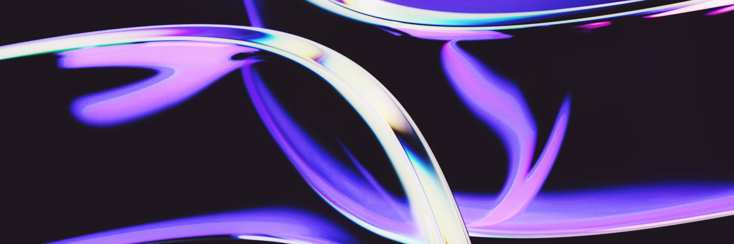
When Apple unveiled its new "Liquid Glass" design language during WWDC 2025, it wasn’t just a visual refresh. Sure, the aesthetic changes across iOS, macOS, iPadOS, and even VisionOS were eye-catching. More translucency, lens-like layering, and reactive highlights. But beneath the surface, Apple signaled something bigger: the beginning of a shift in how users perceive and interact with digital interfaces.
For developers and designers outside the Apple ecosystem, this isn’t just Apple doing Apple things. It’s a temperature check on where UI/UX is headed next. And a nudge to start adapting.
A Subtle Swing Back to Skeuomorphism, With More Intent
Remember the dramatic shift from skeuomorphic to flat design around iOS 7? That was Apple reacting to a maturing user base and a need for digital clarity. With Liquid Glass, we’re not going back to leather textures and beveled buttons, but we are returning to something tactile. UI that feels like it exists in space.
The new design relies on translucency, depth, and dynamic lighting effects to suggest materiality. Icons and windows react subtly as you tilt the screen. Menus float instead of sitting flush. Combined, these cues add back something flat design sacrificed: a sense of dimensionality.
Why now? Because users are acclimating to environments like VisionOS and AR overlays, where the boundaries between physical and digital space are blurrier. Liquid Glass is Apple’s bet that we’re ready to navigate complexity again, so long as it’s done with clarity and polish.
Why This Matters to Developers
This isn’t just a design challenge. For developers, these changes affect how apps are built, rendered, and experienced.
First: performance. Layered, translucent, animated UI elements are GPU-intensive. If your app wasn’t optimized for efficiency before, it’s going to feel sluggish next to Apple’s native experience.
Second: accessibility. These interfaces must still work for people with low vision, motion sensitivity, or older devices. The more dynamic and complex a UI becomes, the more edge cases and fallbacks you need to account for.
Third: user expectations. Whether or not your team is designing for Apple devices, your users are living in a world where these design metaphors are becoming the norm. When they open your app and see flat, static buttons, they might not call it outdated, but the interaction could feel less satisfying or intuitive.
Spatial Thinking Is Quietly Becoming Default
Apple's Liquid Glass isn't just a new skin. It's borrowing visual and behavioral cues from spatial computing. The kind found in AR or VR environments. Whether you're using Vision Pro or not, the OS now teaches users to think in layers, in focus depth, in floating panels. It rewards interaction that's less about page-to-page navigation and more about manipulating objects in context.
That has consequences. If you're building apps, especially ones that involve dashboards, collaboration, or multitasking, you need to start thinking in modules, not screens. In motion, not sequence.
Designing like this doesn't require a spatial headset. But it does require reimagining how hierarchy, user flow, and responsiveness are conveyed. When every interface starts referencing real-world depth, building something static and flat just won’t feel current.
Should You Redesign Your App?
Not necessarily. But it’s a good time to step back and evaluate.
- Does your current design system scale visually? Can it accommodate more layered layouts, animated feedback, or responsive depth?
- How does your app behave in transitions? Are state changes clunky or invisible?
- Are your visual metaphors still helping users orient themselves? Or are they flattening the experience too much?
Liquid Glass is worth watching because it hints at where things are headed. It doesn’t mean every product needs a redesign. But it does mean design systems need to feel more adaptable, alive, and responsive to context.
What to Watch Next
Apple rarely invests this much in interface shifts without a bigger play. Liquid Glass seems designed to build habits and expectations that will carry over into more immersive experiences. AR, spatial computing, and whatever might follow.
The best thing dev teams can do right now? Collaborate more closely with design. Revisit the building blocks of your UI. Look for places where interaction feels overly mechanical or visually out of sync with current expectations.
This new design language is less about aesthetics and more about interaction. Interfaces are starting to feel more like environments than flat layers. That shift matters, especially if you're trying to stay relevant in an increasingly immersive world.
It’s not about catching up to Apple. It’s about making sure your product feels like it belongs in 2025, not 2015.